DICTIONARY DUST JACKET
For our next exercise we will design a dust jacket for the dictionary.
same dimensions as the last project, but four pages instead of two. Front, back, and inside flaps. Please look at the work of Paula Scher as inspiration and point of departure.
Please post the project to your blog by Friday, October 29th.
DEFINITION
constraints:
use 1 of 5 traditional typeface classifications
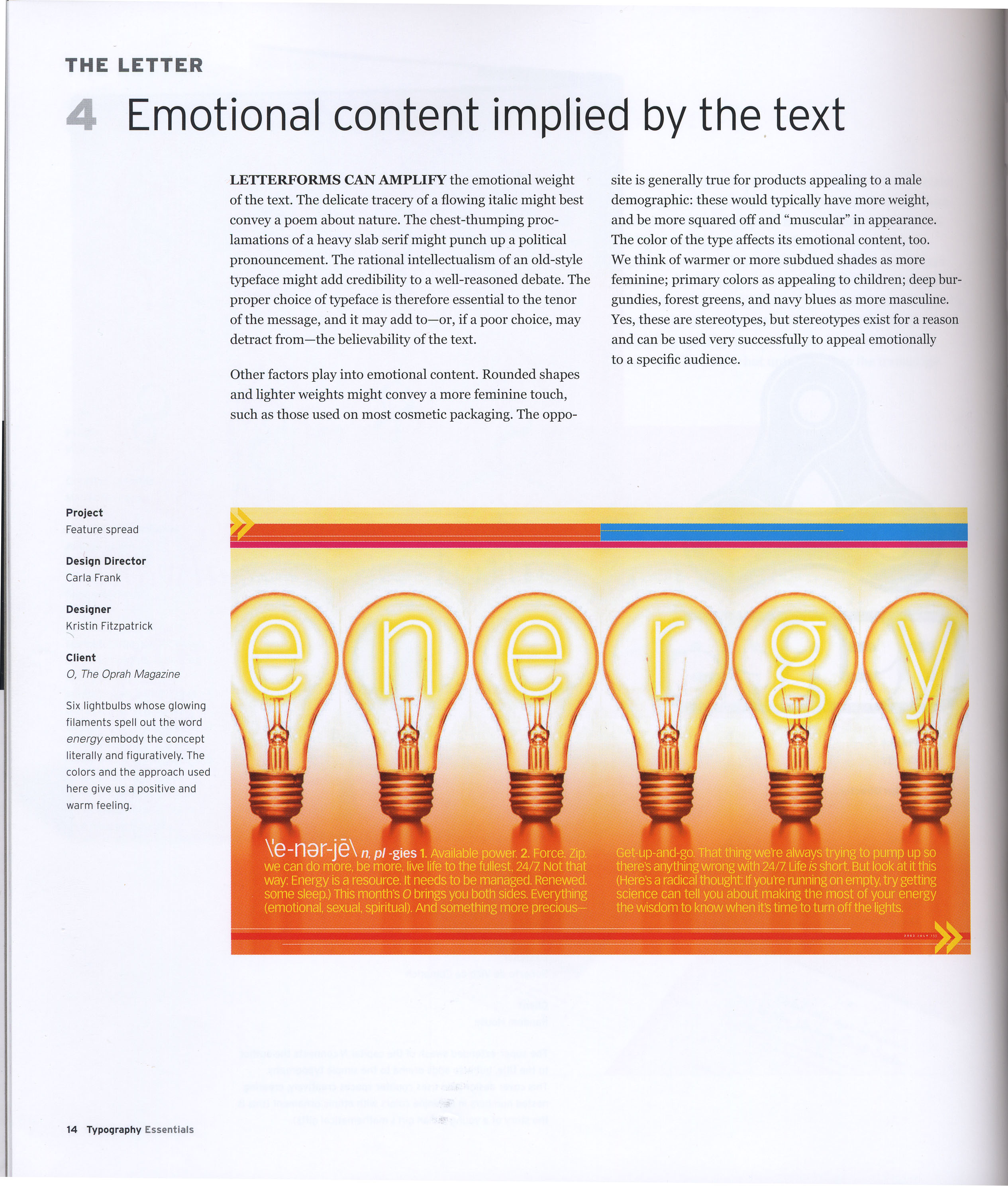
create a two page spread on a landscape legal page that defines a word both verbally and through a visual reinforcement of meaning
use two typefaces on your page
Project 1: Early letterform (Corrections) due Oct. 7
Corrections based on the critique should be printed on 8.5 x 11" paper on the HP Color LaserJet 5550 dn. These corrections should be posted on the wall and to the blog by the beginning of class on Thursday, October 7.
Project 1: Early letterform (Due Dates)
Project 1: Early letterform should be posted to blogs by 8:45 am Thursday, September 23. Our critique for this project will be on Thursday, September 23.
There will be no class in the lab on Tuesday, September 21, as the lab will be closed that day.
Please check the blog that day for the link to the online reading assignment that will take the place of class for Tuesday, September 23.
Project 1: Early Letterform
Assignment:
Select a letter from the Phoenician or Greek alphabet, research the letter, and write approximately 100 words.
Create four two-color designs, each distinctively different, using black and red as shown in the examples. Incorporate your copy into each design. In the first design make the symbol the most prominent element. In the second make the display type the most prominent element. In the third make the text type the most prominent element. All design elements should be two-dimensional. In the final comp make the symbol the most prominent element again.
Each design should be 8" x 8".
It is your choice which of the colors, red, black, or white is used for the page, for the symbol, for the text and display type.
For your text and display type, use one of the 5 typefaces we have been working with thus far:
Garamond
Baskerville
Didot
Century Schoolbook
Helvetica
Remember to consider the issues we have been wrestling with so far in our exercises:
Colors and textures created through letter, word, and line spacing.
Legibility based upon tracking and leading.
Shape created by counterform and the influence on the perception of the composition.
These will be among the topics discussed in critique.
Posted to blogs by Tuesday, September 21. We will critique the electonic versions of these projects on Tuesday, September 21.
Printing in Germany
Gutenberg was the right man because of his familiarity with the craft of the goldsmith and die maker. He was in the right place because Mainz was a cultural and commercial center. It was that right time because the Renaissance thirst for knowledge was creating a growing market for books that could not be satisfied with the traditional handwritten manuscripts.
Handwritten manuscripts were made to order and were usually expensive. They were laboriously copied by scribes who had either to read from a manuscript or have it read to them while copying. This process was not only time-consuming, but led to many errors, which had to be corrected.
Adding to the expense was the scarcity and high cost of vellum and parchment. As a result, these handwritten manuscripts were limited to a select few: clergymen, scholars, and wealthy individuals.
A relatively inexpensive means of producing multiple copies of books seems to have been developed just a little before Gutenberg began his experiments with printing. This was the so-called block book whose pages had illustrations and minimal text cut together on the same block. The carved blocks were inked, and images were transferred onto paper in multiples by rubbing or by the use of a screw press. Block books are believed to have been made for semi-literate, preaching friars who brought the word of God to the urban working class and the poor.
Gutenberg's genius was realizing that printing would be more efficient if, instead of using a single woodblock to print an entire page, the individual letters were cast as separate blocks and then assembled into pages. In this manner, pages could be corrected more rapidly, and, after printing, the type could be cleaned and reused.
Helvetica
Helvetica is a sans serif typeface of Swiss origin. Although typefaces without serifs were used in the nineteenth century, it was not until the twentieth century that they became popular. In 1957 the Haas foundry introduced Haas Grotesk, designed by Max Miedinger (with Eduard Hoffmann), later to become known internationally as Helvetica. Helvetica's large x-height, slightly condensed letters, and clean design make it a very readable typeface. In general, sans serif typefaces have relatively little stress, with optically equal strokes, and should always be leaded.
Century
Century, the first major American typeface, was designed in 1894 by Linn Boyd Benton for Theodore Lowe DeVinne, the printer of The Century Magazine. After Bodoni, type designers began to search for new forms of typographic expression. Around 1815 a typestyle appeared that was characterized by thick slab serifs and thick main strokes with little contrast between the thicks and thins. This style was called Egyptian. Century Expanded is an excellent example of a refined Egyptian, or slab serif, typeface. The large x-height and simple forms combine to make this a very legible typeface.
Didot
Didot is a Modern typeface, named for the famous French printing and type producing family. Firmin Didot cut the letters and cast them as type in Paris. His brother, Pierre Didot, used the types in printing. At the end of the eighteenth century, a fashion grew for faces with a stronger contrast between the thicks and thins, unbracketed serifs, and a strong vertical stress. These were called Modern typefaces. All the older faces became known as Old Style, while the more recent faces just prior to the changes were referred to as Transitional. Although Didot has a small x-height, it appears very wide and black. Because of the strong vertical stress, accentuated by its heavy thicks and hairline thins, Didot should be well leaded.
Baskerville
Baskerville, an elegant, well-designed typeface created by the Englishman John Baskerville in 1757, is an excellent example of a Transitional typeface. Transitional typefaces are so called because they form a bridge between the Old Style and the Modern faces. Compared to the Old Style, Transitional typefaces show greater contrast between the thicks and thins, serifs are less heavily bracketed, and the stress is almost vertical. Baskerville characters are very wide for their x-height, are closely fitted, and are of excellent proportions. Baskerville is considered one of the most pleasant and readable typefaces.
Garamond
Garamond is a classic Old Style typeface. Claude Garamond, who died in 1561, was originally credited with the design of this elegant French typeface; however, it has recently been discovered that this typeface was designed by Jean Jannon in 1615. Many of the present-day versions of this elegant typeface may be either Garamond or Jannon designs, although they are all called Garamond. This is a typical Old Style face, having very little contrast between the thicks and thins, heavily bracketed serifs, and oblique stress. The capital letters are shorter than the ascenders of the lowercase letters. The letterforms are open and round, making the face extremely readable.
TYPE ARRANGEMENT/Paragraph Indications
Type Arrangements
Create a layout for each of the five typefaces following the arrangement constraints provided.
Use the text provided on the bottom link, the text that refers to the specific typeface. Point size for display type is 72. Point size, tracking, and leading will vary from comp to comp, but should be determined in an effort to provide a pleasing arrangement, a balanced and legible design.
Using the text provided by the text link, use each of our five typefaces once to create five different designs demonstrating five different ways of indicating paragraphs. Please view all 30 examples before beginning. Do not copy the examples, but rather come up with your own new and creative way based upon them.
5 posts for 5 type classifications
6"x6"
Remember to name the blog post after the typeface
post 4 designs for each typeface
p432
p1296
two larger than 1296 (converted from type to shapes)
highlight the unique characteristics of the letterform and the typeface
keep in mind the contrast between form and counter-form
note the point at which the letterform is no longer recognizable
(one of the points of the exercise is to find that moment when the letterform no longer reads, make sure you push one design to that point)
FIVE TYPE CLASSIFICATIONS with specimens
Old Style:
Garamond
1615
Other examples of Old Style Typefaces:
Adobe Caslon Pro
Caslon
Garamond Premier Pro
Garamond
Adobe Garamond Pro
Garamond
Goudy Old Style
Goudy Old Style
and more:
Dante, Adobe Jenson, Palatino
Aldine, Bembo, Caslon, Dante, Galliard, Palatino, Plantin, Sabon
Transitional:
Baskerville
1757
Other examples of transitional typefaces:
Georgia
Times
Times New Roman
Joanna
Perpetua
Bulmer, Cochin, Fairfield, Janson Text, Mrs Eaves, Usherwood, Veljovic Book, Zapf International
Modern:
Didot
1784-1811
Other examples of modern typefaces:
Modern No. 20
Bodoni, Didot
Bernhard Modern, Fenice, Filosophia, Modern, Modern Wide, Torino, Waldbaum
Egyptian/
Slab Serif:
Century Schoolbook
1915
Other examples of Egyptian typefaces:
Century, 1894
Clarendon, Rockwell
City, Egyptian, Glypha, Lubalin Graph, Quadraat, Serifa, Stymie, Swift
Sans Serif:
Helvetica
1957
Other examples of San Serif typefaces:
Franklin Gothic Book
Franklin Gothic Medium
Futura
Gill Sans
Grotesque, Franklin Gothic, Frutiger, Meta, News Gothic, Optima, Syntax, Trade Gothic
Akzidenz Grotesque, Meta, Scala Sans, Univers
Anatomy
type terminology lexicon from a type primer, John Cane, Prentice Hall, 2003:
Baseline-The imaginary line defining the visual base of the letterforms.
Median-The imaginary line define the x-height of the letterforms.
X-height-The height in any typeface of the lowercase 'x'.
Stroke-Any line that defines the basic letterform.
Apex/Vertex-The point created by joining two diagonal stems(apex above, vertex below).
Arm-Short strokes off the stem of the letterform.
Ascender-The portion of the stem of a lowercase letterform that projects above the median.
Barb-The half-serif finish on some curved strokes.
Beak-The half-serif finish on some horizontal arms.
Bowl-The rounded form that describes a counter. The bowl may be either open or closed.
Bracket-The transition between the serif and the stem
Counter-The negative space within a letterform, either fully or partially closed.
Cross Bar-The horizontal stroke in a letterform that joins two stems together.
Cross Stroke-The horizontal stroke in a letterform that intersects the stem
Crotch-The interior space where two strokes meet
Descender-The portion of a stem of a lowercase letterform that projects below the baseline
Ear-The stroke extending out from the main stem or body of the letterform.
Em/en-Originally referring to the width of an uppercase M, an em is now the distance equal to the size of the typeface(an em in 48 pt. type is 48 points) An en is half the size of an em.
Finial-The rounded non-serif terminal to a stroke.
Leg-Short stroke off the stem of the letterform, either at the bottom of the stroke or inclined downward.
Ligature-The character formed by the combination of two or more letterforms.
Link-The stroke that connects the bowl and the loop.
Loop-The bowl created in the descender of the lowercase G.
Serif-The right angled or oblique foot at the end of the stroke.
Shoulder-The curved stroke that is not part of a bowl.
Spine-The curved stem of the S.
Spur-The extension that articulates the junction of a curved and rectilinear stroke.
Stem-The significant vertical or oblique stroke.
Stress-The orientation of the letterform, indicated by the thin stroke in round forms.
Swash-The flourish that extends of the stroke of a letterform.
Tail-The curved or diagonal stroke at the finish if certain letterforms.
Terminal-The self-contained finish of a stroke without a serif, a catch-all term.
Subscribe to:
Posts (Atom)